So I’m new new to lasers. How can I make this clearer?
what power and settings are you using. Please be kind to those who want to help by providing as much information as you can as this will reduce many question and answer messages
Sure. The material is cork. I was using the 1600 laser. I was using the same settings from this guide. (I thought the text is under vector. But I might try the B&W next)
It should be noted that when I tried the grayscale settings for another part it didn’t show an image at all.
I would do some testing; use the piece that you have just used.
i would try 60%, then 70% and then 80% and see how they look.
Keep in mind reference guides are just that, a guide. The type and quality of material will require some testing for the best settings.
Doug
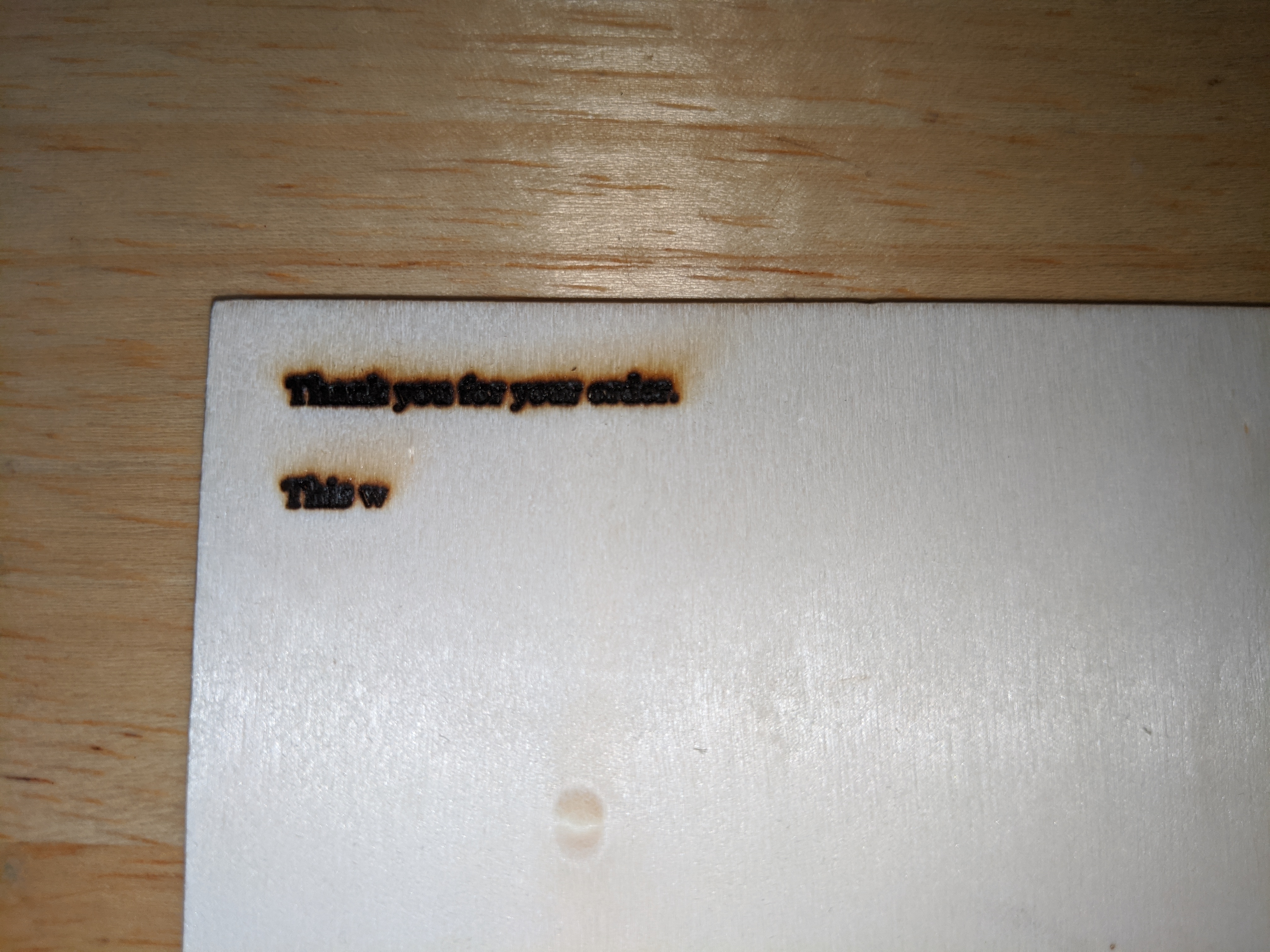
I took an image of what it looks like now. I needed to increase the power to 85% and increase the size of the text. Oh and I changed it from a text to picture. In short I just wrote it out in paint, and did a grayscale on that. I still can’t figure out how to do solid text through the software.
What it doesn’t show is as the laser went from left to right. The text was less burnt in on the right. However, I was able to do another pass and that made everything more than less the same.

well done, it is a bit of ‘black art’ to get it right. The wood may also be a little warped with a rise and fall in it that will effect the laser writing. Keep experimenting and you will get there.
Doug
I’m not sure if you seen my edit, but one of the things I had to do to get the text like this was write it in paint. And then grayscale it on the software. How can I just have solid text as seen here vs just the outline of the letters?

